8 Simple Kitchen Remodeling Tips to Make Your Kitchen Look More Sophisticated
When remodeling your kitchen, many people focus on color schemes and overall style. The color combination of countertops, backsplashes, and cabinets directly impacts the visual appeal and user experience of the kitchen. This article will share some simple kitchen remodeling tips to help you better understand how to create a more harmonious kitchen space.

Creating a sophisticated kitchen is less about spending more and more about making coordinated choices. Color relationships among your backsplash, countertop, and cabinets have an outsized impact on how polished the room feels. The following eight tips focus on those relationships—plus a few details like finish, grout, and lighting that subtly raise the overall look.
Should you choose a matching or contrasting color for your kitchen backsplash?
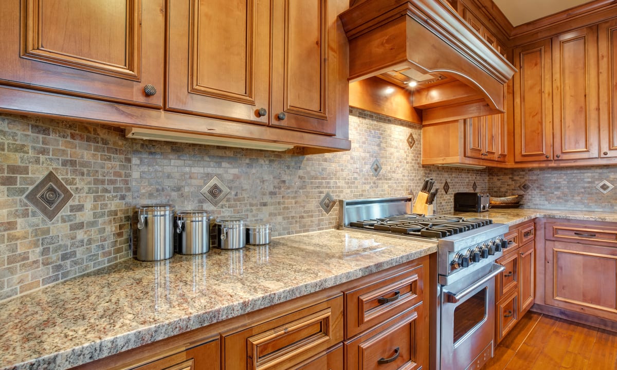
A matching backsplash blends with counters and cabinets to create a calm, unfussy backdrop, ideal if you prefer minimal visual noise or have richly veined stone that already draws attention. A contrasting backsplash introduces a focal point and can work well in simple kitchens that need definition. Tip 1: If you choose contrast, keep it refined by using desaturated hues or soft patterns rather than high-chroma colors. Tip 2: When matching, vary texture—think matte ceramic with a soft-sheen quartz—to add depth without introducing a new color.
How to coordinate the colors of your countertop and backsplash?
Start with undertones. Quartz, granite, marble, and even concrete have warm, cool, or neutral undertones that should align with your tile or slab. Tip 3: Hold physical samples side by side in natural and artificial light to confirm undertone alignment; the right pair will look harmonious in morning and evening. Tip 4: Use grout as a bridge—select a grout shade that echoes the countertop’s secondary tone so the transition reads intentional. Keeping patterns to one surface (slab or tile) and letting the other read solid or very quiet also helps the eye rest.
Should the backsplash be lighter or darker than the countertop?
Either can work, but the most forgiving approach is a slightly lighter backsplash that bounces light and visually lifts the upper half of the room. This is helpful in smaller kitchens or those with limited daylight. A darker backsplash can feel sophisticated when paired with generous lighting and lighter counters for contrast. Tip 5: Choose finish carefully—gloss amplifies light and looks crisp on light tiles, while matte or honed finishes on darker surfaces feel subtle and reduce glare. Tip 6: For maximum cohesion, consider running the countertop material up the wall as a short or full-height slab backsplash.
Which color combination looks more sophisticated?
Refined palettes are restrained, typically two to three core hues plus one metal. Consider time-tested combinations such as soft white and warm wood with brushed nickel; greige and cream with aged brass; charcoal and walnut with stainless steel; navy and marble with polished nickel; or sage and limestone with brushed brass. Tip 7: Limit the palette and repeat it across surfaces—cabinets, tile, paint, and textiles—so the room reads as a single composition. Keep metals consistent across hardware and lighting to avoid a fragmented look, or deliberately use two finishes in a clear ratio (for example, 80% brushed nickel, 20% aged brass).
Should the backsplash match the countertop or the cabinet color?
Match the element that anchors your design. If your cabinets are painted a statement color, echo that family with a quieter backsplash and let the counter provide gentle contrast. If your countertop has distinctive veining, let it lead and choose a backsplash that repeats a vein tone. Tip 8: Build a mini sample board—cabinet door, counter chip, two tile options, grout strip, and metal swatch—and view it under your actual kitchen lighting at different times of day to confirm balance before you commit.
Beyond color, several small choices elevate sophistication without overpowering the room: - Opt for larger-format tiles or slabs to reduce grout lines and visual clutter. - Align tile edges with key sightlines (range width, hood, or window edges) for crisp geometry. - Use slim or color-matched outlets and switch plates on the backsplash to minimize distractions. - Calibrate lighting: under-cabinet LEDs at 2700–3000K create warm, flattering illumination across tile and stone; dimmers add flexibility. - Choose hardware with clean profiles and quality finishes, and repeat the same finish on faucets for continuity.
Pulling the look together also means thinking about proportion. Keep a noticeable but not jarring contrast ratio between cabinets, counters, and backsplash—many designers favor a dominant neutral (about 60%), a secondary tone (30%), and an accent (10%). If you’re drawn to pattern, select one statement surface and let the rest play a supporting role. Conversely, if all surfaces are quiet, add texture—ribbed tile, honed stone, or brushed metal—to avoid a flat appearance.
Finally, plan for maintenance. Light grout on a heavily used range wall can discolor; darker or stain-resistant grout maintains a crisp look longer. Honed and matte surfaces show fingerprints less than high-gloss, while some natural stones require periodic sealing to preserve their finish. Thinking through upkeep ensures your sophisticated palette stays that way over time.
A thoughtful color strategy—anchored by undertone alignment, measured contrast, and repeatable materials—creates a kitchen that feels composed and enduring. By testing samples in real light, limiting your palette, coordinating finishes, and choosing textures that work together, you can deliver a quietly elegant space that looks intentional from every angle.


